Charlotte Tilbury · Academic Team Project · E-commerce Redesign · Team of 5
Luxury shouldn't take effort.
One of beauty's most beloved e-commerce sites — redesigned to feel as premium as the brand itself.
Independent academic redesign — not affiliated with Charlotte Tilbury.
A luxury beauty brand whose site demanded effort — slow loads, cluttered pages, and navigation that buried the products.
UX research, information architecture, user flow, the product-listing experience, and responsive UI — my workstreams within a team of five.
A responsive prototype tested with participants: cleaner layouts, smarter filters, and a clearer purchase flow across selected desktop and mobile widths.
Independent academic redesign at Touro University — not affiliated with Charlotte Tilbury; no access to internal data.
As premium as
the products.
Cleaner layouts, smarter filters, and a clearer purchase flow — the full redesign, before the process that produced it.
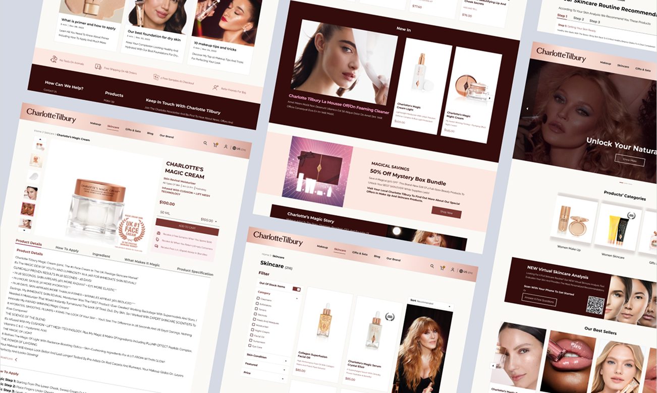
A luxury brand with a frustrating website.
The brand promises glamour without effort. The site demanded plenty of it — slow loads, cluttered pages, and navigation that buried the products.
Our team of five redesigned the selected e-commerce experience across desktop and mobile prototypes and tested the key product-discovery flow with users.
Five designers, one shared audit — and my own workstreams to carry.
My role and contribution
Owned
My workstreamsThe research foundation and the responsive listing experience — mine to shape from audit to high fidelity.
Shared
With the team of fiveWith Joel De La Rosa, Olha Velykholova, Ozair Iyoob, and Chancey Tallbott — one evidence base, five hands.
The site we started from.
Heavy promotional banners, multi-step discovery, limited mobile adaptation in the pages we audited, no personalization.
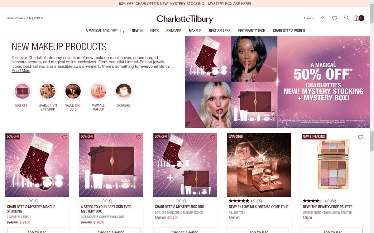
Before · Promotional Landing
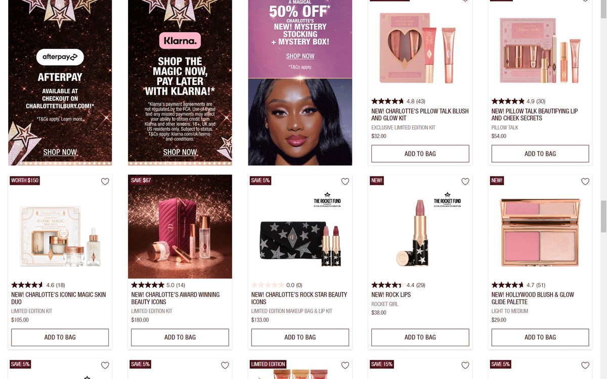
Before · Product Listing
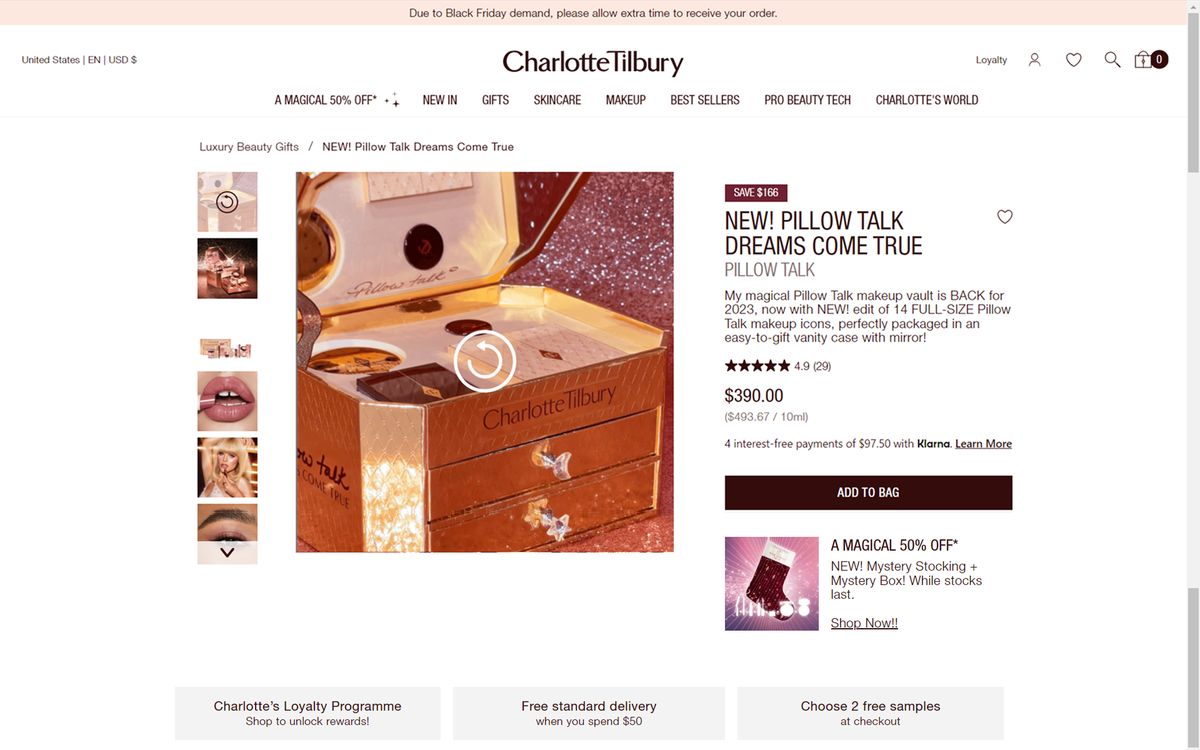
Before · Product Detail
Evidence before pixels.
We audited the site against Nielsen's 10 heuristics, scoring each issue 0–4 by severity. Three critical findings set the agenda for everything that followed.
Slow loading
4–6 second loads with no progress indicator — users bounced before seeing a single product.
Confusing navigation
Overlapping categories and limited filters — no way to narrow by shade, or find the way back.
Cluttered layouts
Banners, upsells, and products competed equally — nothing had room to breathe.
I need to find exactly what I need, quickly — I don't have time to dig.
Jane, 27 · Make-Up Artist at Sephora · New York
Built from Similarweb audience data, used as a directional secondary-research input — the data suggested that women aged 25–34 represented a key audience segment during the research period. Source: Similarweb audience data, accessed October–November 2023.
- Method
- User interviews
- Sample
- n=8
- Phase
- Discovery research
Jane's path from discovery to checkout — the heaviest friction sat in browsing, comparing, and product detail.
Discover
Arrives from social
Instagram ads · influencer swatches
SmoothBrowse
Explores categories
Slow page loads · pop-ups interrupt
High frictionCompare
Narrows the options
Filters too limited · can't sort by shade
High frictionProduct Detail
Evaluates the product
Dense, competing info · unclear hierarchy
High frictionCheckout
Completes purchase
Cart works well · flow is acceptable
SmoothFour objectives,
from evidence.
Every screen that follows had to serve four goals — remove the friction, keep every ounce of the brand.
Effortless
discovery
Filters for shade, finish, and skin concern create a clearer path to relevant products.
Grounded in"Limited filters" — no way to narrow by shade, skin tone, or product type.
Mobile-first
usability
A responsive experience across the selected desktop and mobile layouts — the context where Jane actually shops.
Grounded inIn the pages our team audited, dense promotional layouts showed limited adaptation at the selected mobile widths.
Personal
recommendations
A virtual skin analysis that turns anonymous browsing into a tailored routine.
Grounded inNo personalization — every visitor saw the same promotional wall.
Confident
purchases
Calmer pages and clear hierarchy — the purchase never fights the promotion for attention.
Grounded in"Cluttered layouts" — banners, upsells, and products competing equally.
The structure earned
its polish.
Layout and flow were tested with participants at mid fidelity — before a single visual decision was committed.
- Method
- Moderated usability testing
- Sample
- n=6
- Phase
- Responsive prototype evaluation
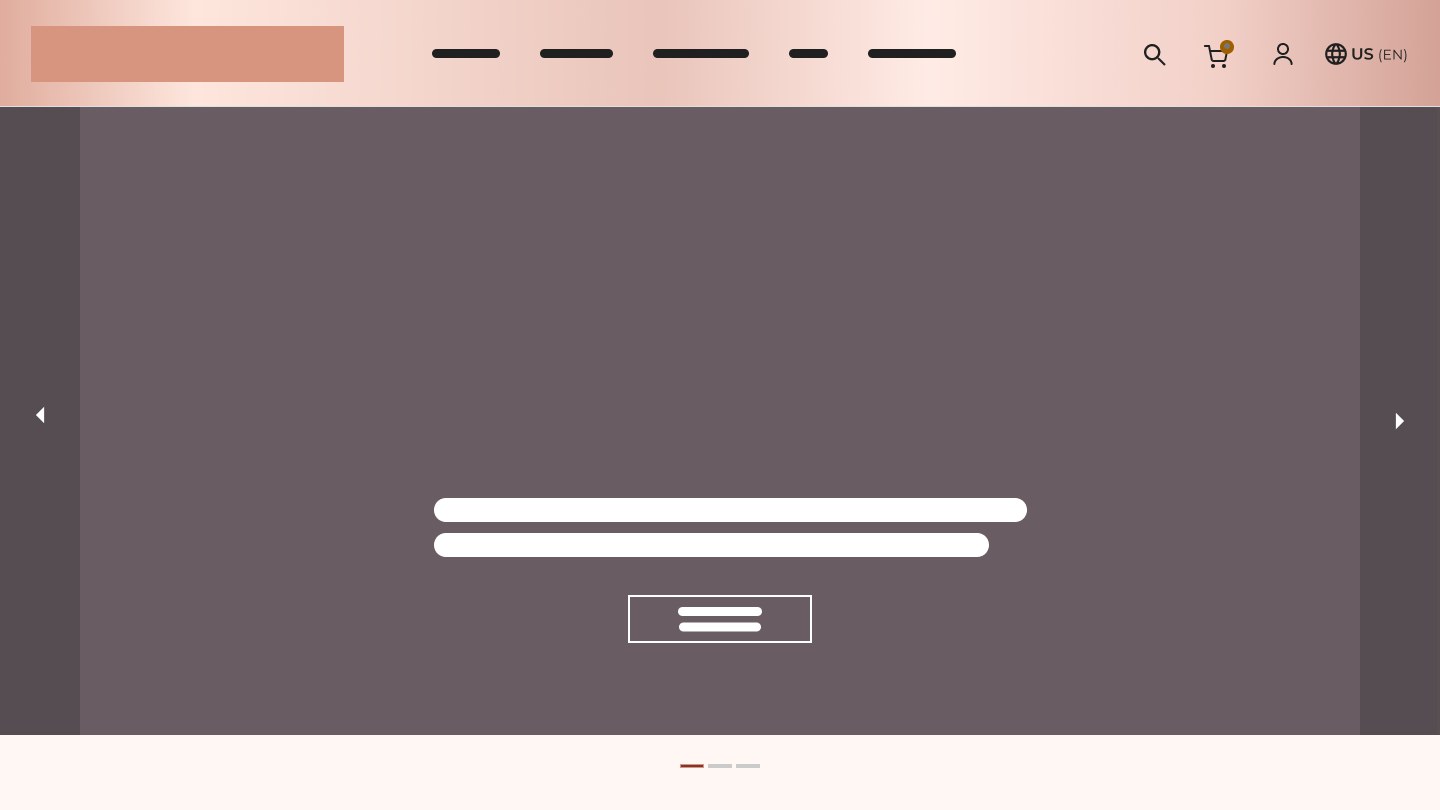
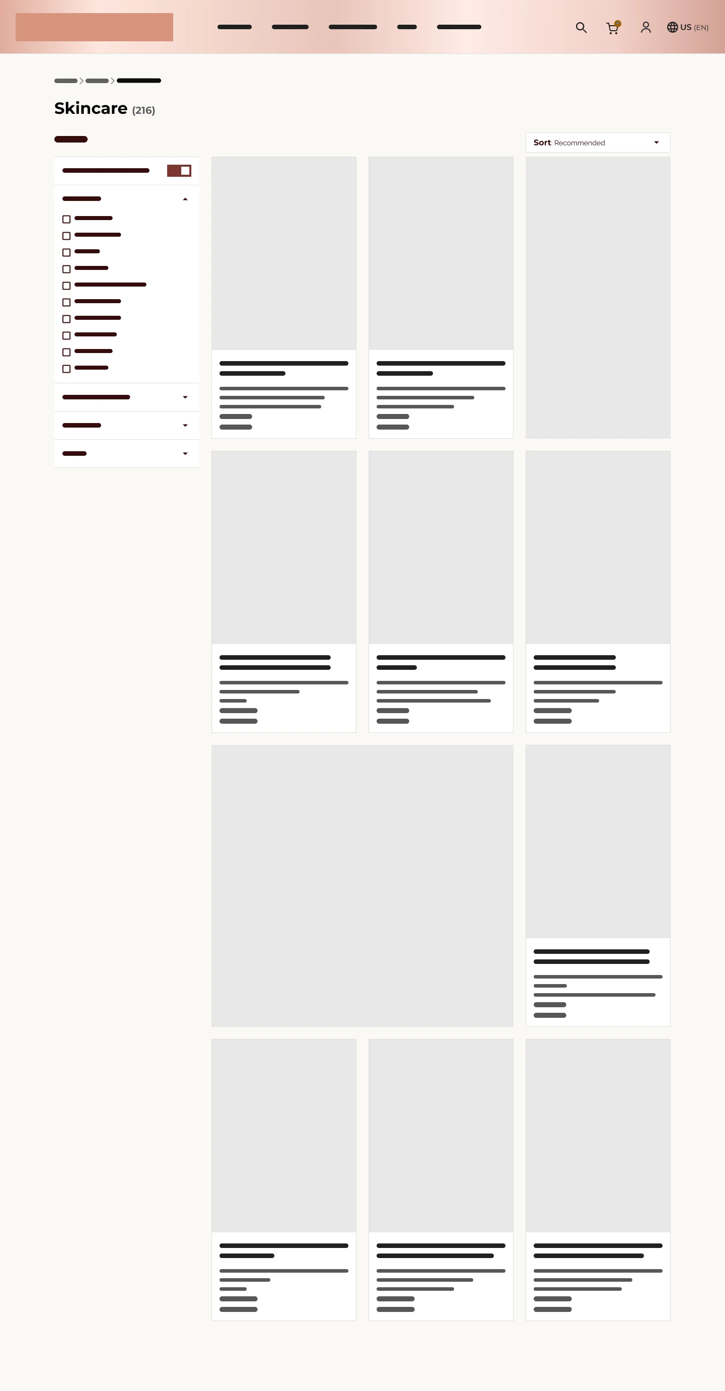
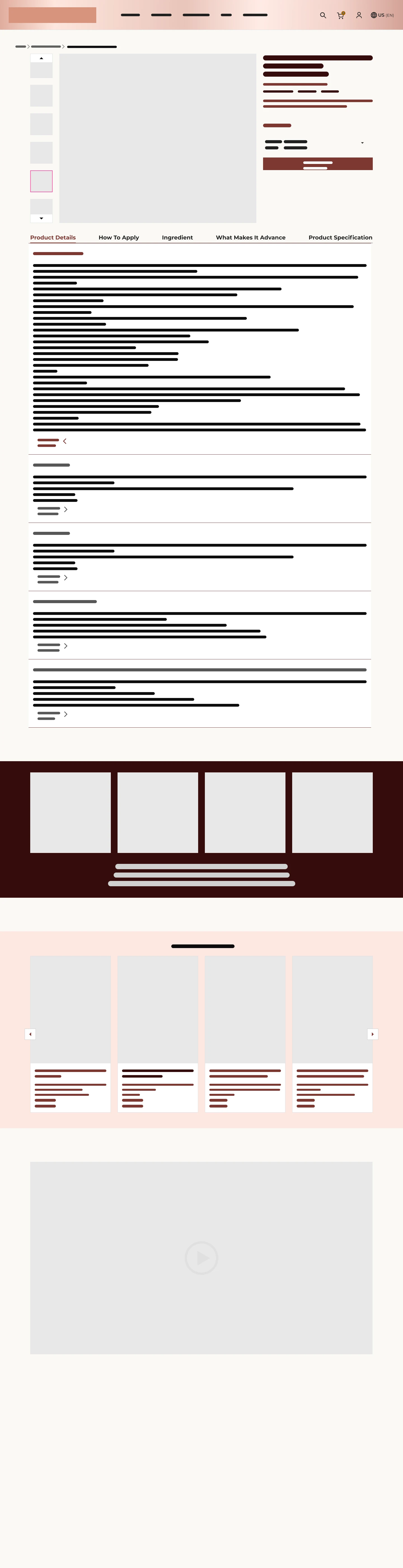
A quieter canvas
for a bold brand.
The rose-and-burgundy identity, given room to breathe — photography-first modules and generous whitespace carry the luxury while the UI stays quiet.
Rose Champagne · #ECCAC0Blush Tint · #F2E7E1Porcelain · #FAF9F5Deep Burgundy · #3E1414Ink · #1A1A1ASurface · #FFFFFFThe brand keeps its voice — the interface stops shouting.
Six changes carried
the redesign.
Each decision pairs the desktop experience with its mobile counterpart across the selected responsive layouts.

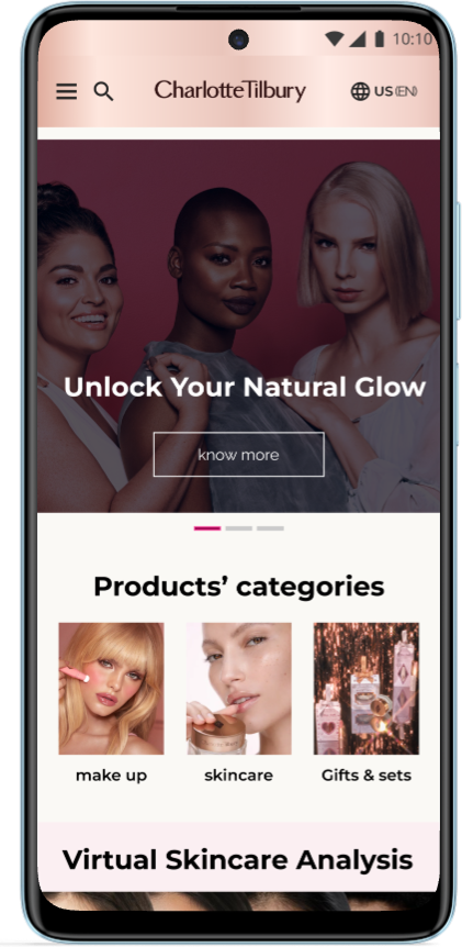
Decision 01 · Homepage
One message, one CTA
A single hero with a clear call to action replaced stacked promotions.
WhyThe original buried products under competing campaigns — the first screen now answers "where do I start?"
Decision 02 · Product Discovery — my workstream
The right shade,
without the digging.
Filters for shade, finish, skin concern, and price — with a cleaner, breathable grid. From user flow to final responsive UI.
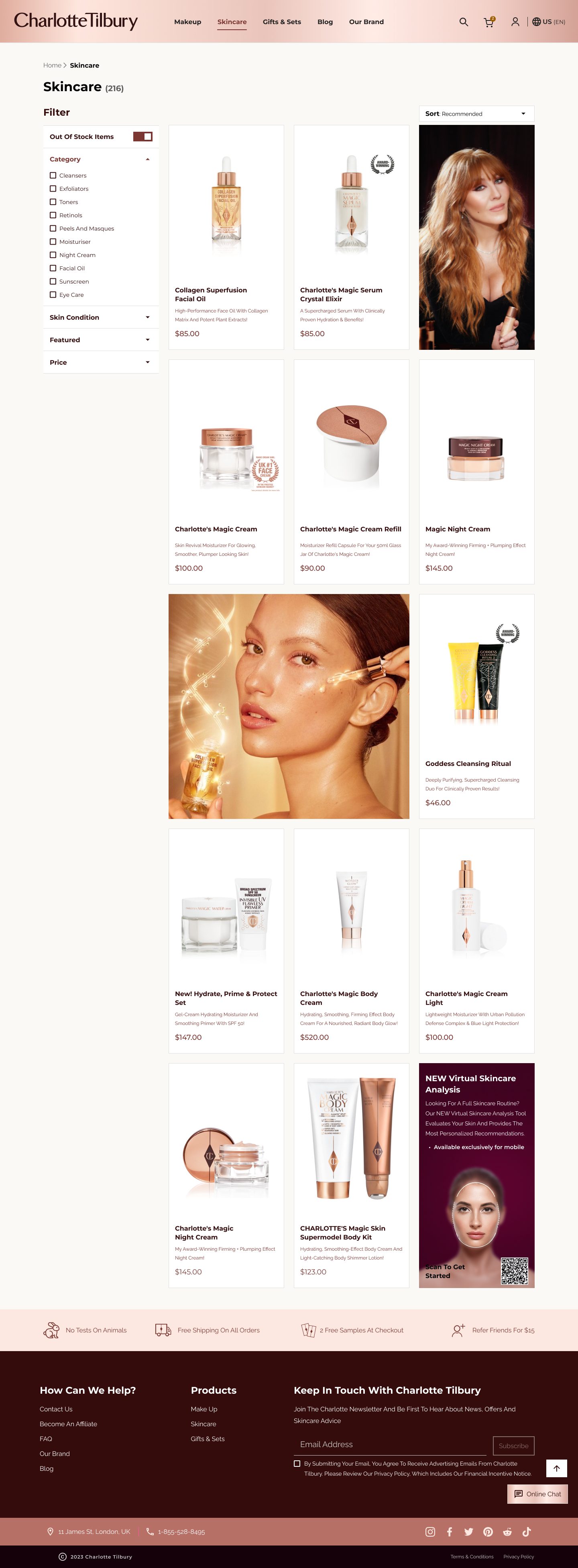
Participants completed the selected product-finding task without major navigation blockers.

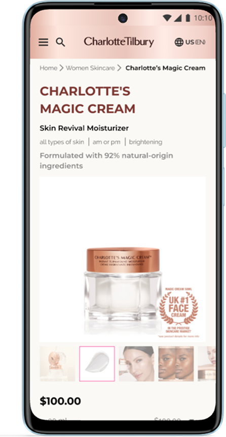
Decision 03 · Product Detail
One decision at a time
Hero image, shade selector, key info, then reviews — one decision at a time.
WhyThe original mixed swatches, reviews, and upsells without hierarchy — the page now reads in the order Jane decides.
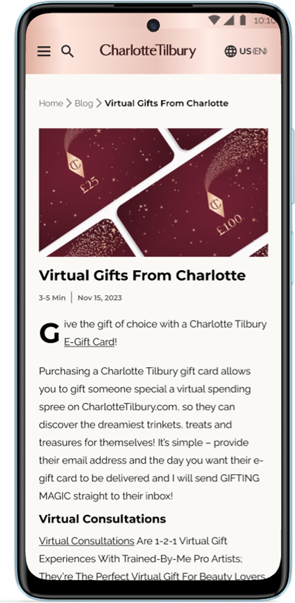
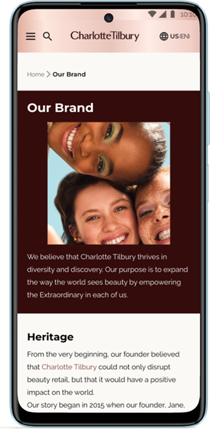
Decision 04 · Responsive Experience
Premium, pocket-sized
Mobile layouts carry the same hierarchy and navigation as desktop — browsing and checkout stay familiar on a phone.
WhyThe pages we audited did not adapt effectively at the mobile widths examined — so responsiveness was designed in from day one.
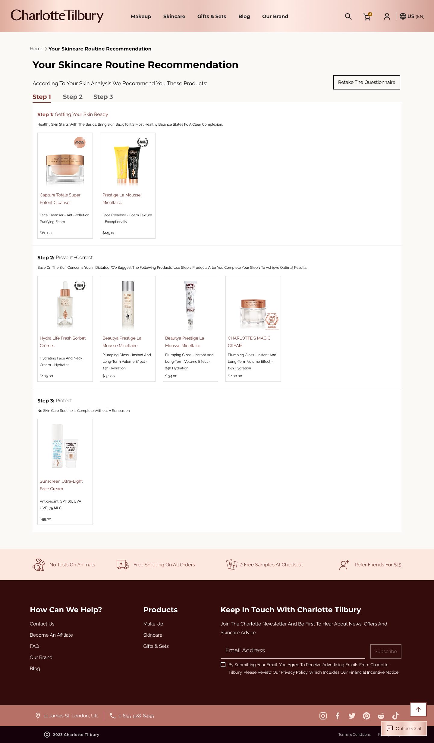
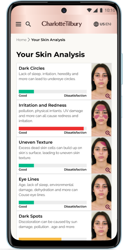
Decision 05 · Personalization
From selfie to routine
The virtual skin analysis scores concerns, then builds a tailored three-step routine — anonymous browsing becomes personal recommendation.
WhyPersonalization was the gap no promotion could fill — the analysis gives every visitor a reason to return.
Decision 06 · Navigation
The whole map,
one hover.
A structured mega-menu replaced the overlapping categories our team's heuristic audit flagged at 4/4 severity — makeup, skincare, and the analysis tools reachable in a single hover, with a clear way back.
Before — Original navigation
Promo bar and banner compete with the nav · no visual map.
After — Structured mega-menu
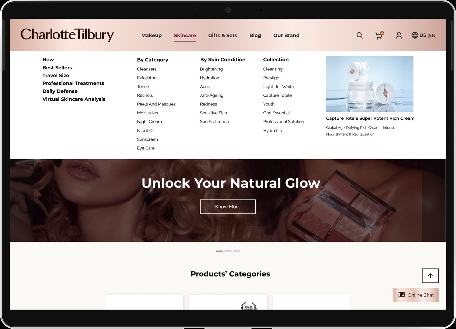
Every category in a single hover · clear grouping.
The redesign,
running.
Recordings of the working Figma prototypes, at 1.5× speed.
Desktop — home & brand, shopping flow, navigation, skin analysis · Mobile — browsing, add to cart, skin analysis
As premium as
the products.
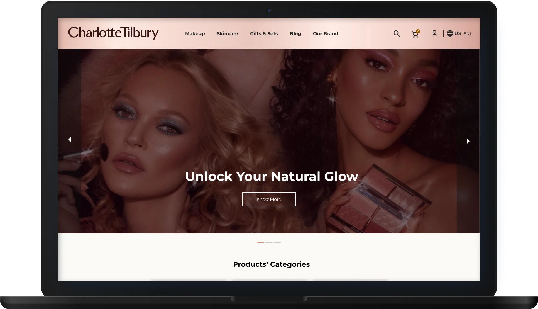
The Homepage
One message,
room to breathe.
The promotional wall is gone — and the first screen finally feels like the brand.
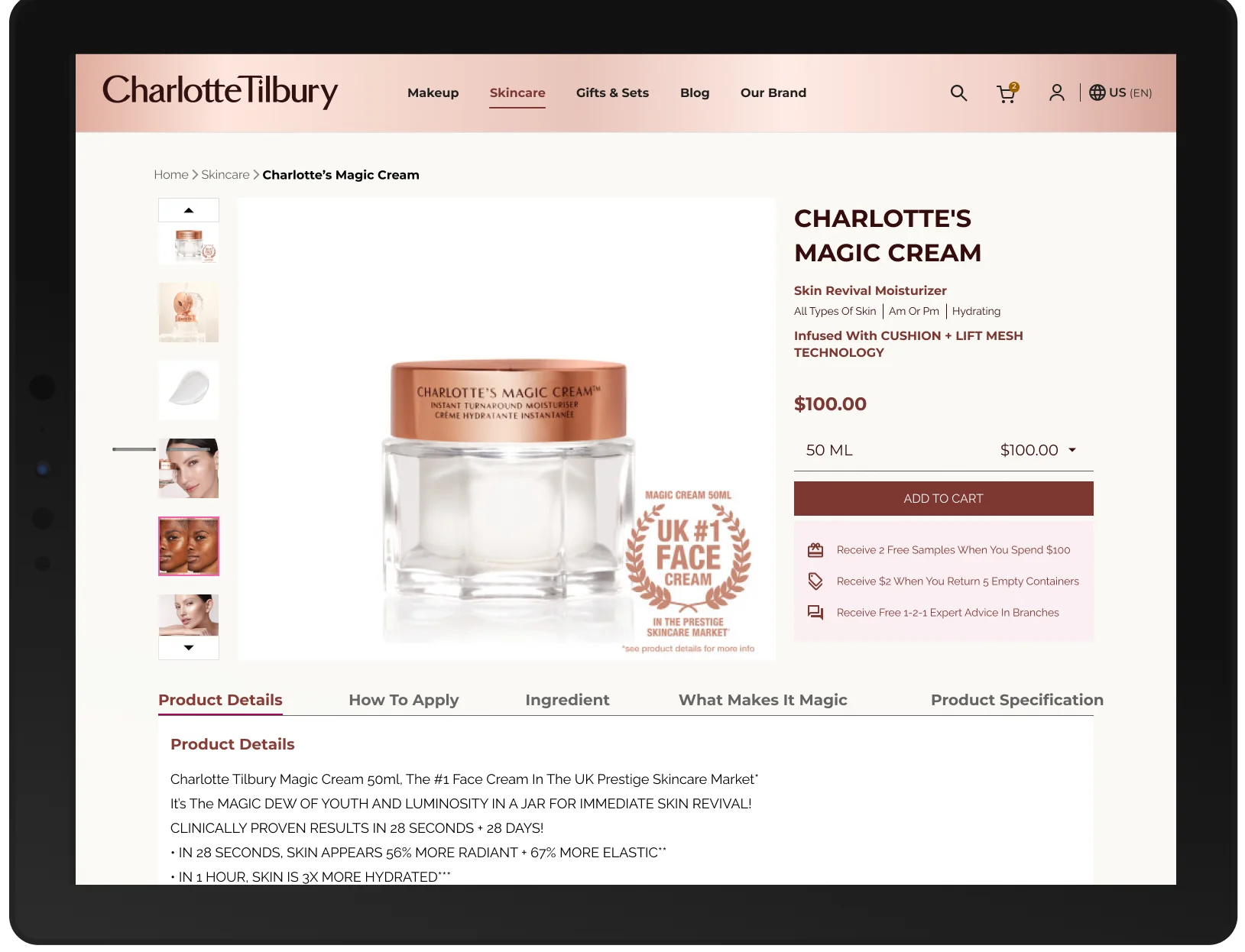
Product DetailThe purchase journey, organized consistently across the selected desktop and mobile layouts.
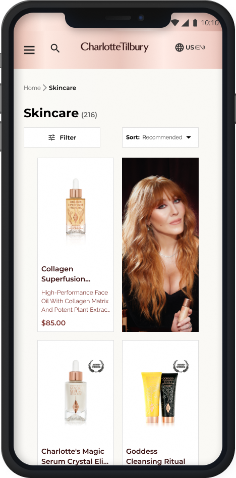
Mobile DiscoveryFilters and a breathable grid — where Jane actually shops.
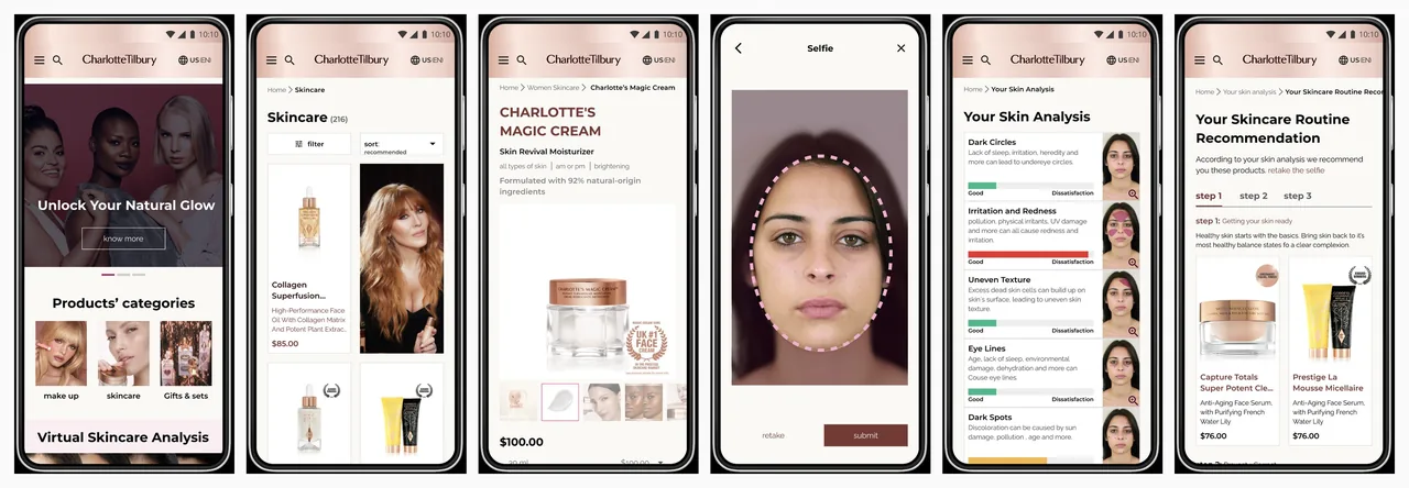
The responsive system — home, listing, detail, brand, skin analysis, and recommendation
10 — Reflection
The lesson: luxury branding and usability aren't rivals — preserving the brand's identity while improving clarity and discovery required both.
The heuristic evaluation gave all five of us a shared, evidence-based foundation — every decision traceable to a real usability issue.
Testing with real Charlotte Tilbury customers — rather than classmates — would have surfaced friction we rationalized away.
A visually overwhelming shopping experience became cleaner, more focused, and more consistent with the brand.